Home page test
Create a new Home Page
Now delete the default codes in page.tsx in app folder, and create a Home Component with some tailwindcss codes styles:
You could type sfc snippets to create components fast. Make sure you’ve installed the Simple React Snippets plugin in vscode.
By the way, Tailwind CSS IntelliSense plugin is also recommended to install, because it provides instant hints about tailwindcss code when you write styles.
const Home = () => {
return (
<div className="flex min-h-screen items-center justify-center">
<p>Home Page</p>
</div>
);
}
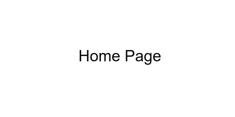
export default Home;You should see a “Home Page” in your browser:
Test Shadcn Button
Now let’s add a shadcn Button component to the Home page:
import { Button } from "@/components/ui/button";

const Home = () => {
  return (
    <div className="flex min-h-screen items-center justify-center">
      <Button>Click me</Button>
    </div>
  );
}

export default Home;
Now you’ll see a black button on your home page.
You could also try other styles of the Button component by adding variant property:
import { Button } from "@/components/ui/button";
const Home = () => {
return (
<div className="flex min-h-screen items-center justify-center">
<div className="space-x-2">
<Button variant="default">Default</Button>
<Button variant="destructive">Destructive</Button>
<Button variant="outline">Outline</Button>
<Button variant="secondary">Secondary</Button>
<Button variant="ghost">Ghost</Button>
<Button variant="link">Link</Button>
</div>
</div>
);
}
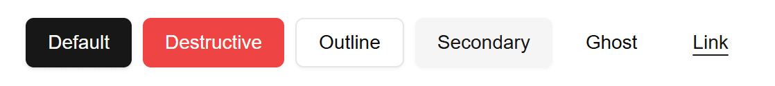
export default Home;Here are the six variants of Button component:
Customize Shadcn Button
Don’t forget that shadcn is a customizable components lib, you could change it’s default code to customize your own style. Let’s take the Button component as an example. Add a theme variant to the button component file:
    variants: {
      variant: {
        ...,
        link: "text-primary underline-offset-4 hover:underline",
        theme: "bg-blue-500 text-blue-100 shadow-sm hover:bg-blue/80"
      },
      ...
    }
then add a theme button in the Home Page:
import { Button } from "@/components/ui/button";
const Home = () => {
return (
<div className="flex min-h-screen items-center justify-center">
<div className="space-x-2">
<Button variant="default">Default</Button>
<Button variant="destructive">Destructive</Button>
<Button variant="outline">Outline</Button>
<Button variant="secondary">Secondary</Button>
<Button variant="ghost">Ghost</Button>
<Button variant="link">Link</Button>
<Button variant="theme">Theme</Button>
</div>
</div>
);
}
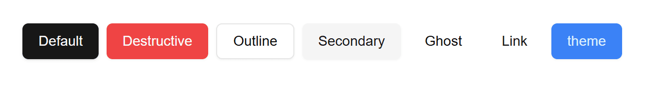
export default Home;then you can see the theme button like this:
You can customize the styles of these components according to your own needs.